GET LOST ON PURPOSE!
A conceptual travel app- UX case study
Platform: Mobile
Design tools: Figma, Google Meet (for remote usability testing)
Role: UX Designer (concept, creation, prototyping, usability testing)
Duration: 4 weeks - Class project, March 2025
Challenge
Based on interviews that I conducted, many travelers, especially families and last-minute planners, find current platforms like Airbnb and Booking.com impersonal, reviews are hard to trust, and map navigation can feel overwhelming which often leads to incomplete bookings and in most cases frustration.
The goal was to address the concerns of finding trusted reviews and booking options.
Approach
Research
Sent out surveys to understand user needs.
I created two proto-personas with different user stories based on the needs observed from the surveys:
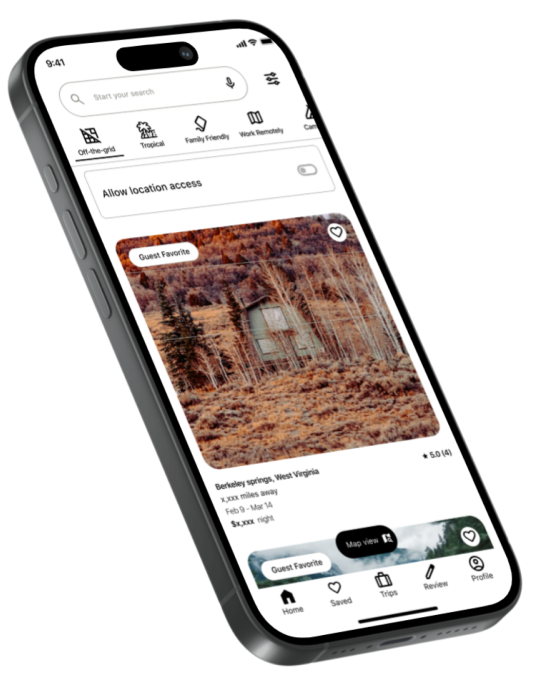
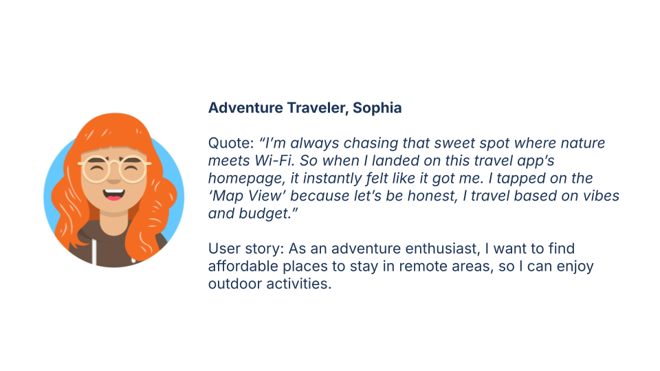
User story 1: As an adventure enthusiast, I want to find affordable places to stay in remote areas, so I can enjoy outdoor activities.
User story 2: As a family traveler, I want to confidently find a suitable place for my family by reading reviews and recommendations, so I can plan a safe and enjoyable trip.

Design Exploration and Iteration
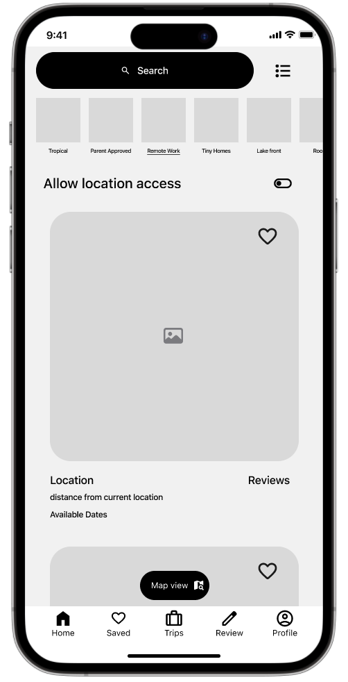
Created a low-fidelity wireframe to test layout, then a mid-fidelity prototype for clarity and navigation based on usability testing results
Usability Testing
Ran remote moderated tests with mid-fidelity prototype on 6 participants to measure task completion, time on task and verbal feedback.
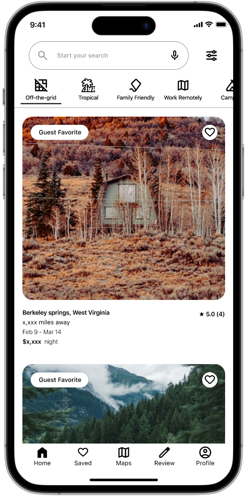
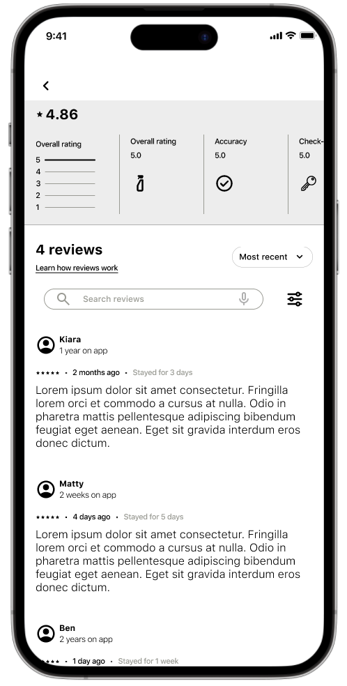
Core tasks: find remote stays, view map, read reviews, locate family-friendly options.
First usability test showed:
40% participants struggled to locate reviews, 4 had issues with accessing map view.
70% requested bundled booking options (stay + activity).
Outcome
The final prototype delivered a clearer, user-centered experience that better supported returning users:
Usability testing results:
80% of participants successfully completed core tasks, each in under 20 seconds.
Participants described the interface as less overwhelming and more engaging compared to the original.
Design improvements included:
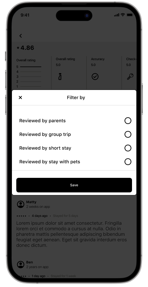
A refined review-based filter tailored to traveler type, increasing trust and content visibility.
Integrated bundled booking suggestions to streamline decision making.
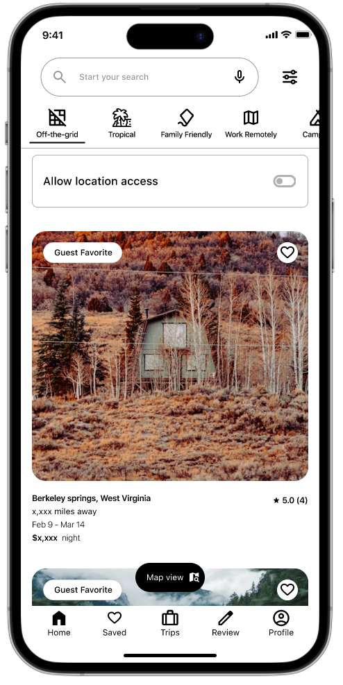
A repositioned map button within the bottom navigation, improving accessibility while freeing up vertical space for scrolling.

Next steps:
If developed further:
Expand testing with a larger, more diverse sample.
Explore accessibility features (dark mode, navigation alternatives)
Reflection
This project strengthened my skills in design systems, usability testing, and rapid prototyping. I learned how small usability adjustments—like improving map visibility or surfacing reviews—can significantly affect user confidence and engagement.