Light and Dark Mode
Platform: Mobile
Design Tool: Figma
Role: Junior Product Designer (UI systems, accessibility, prototyping)
Duration: Short project
Challenge
Many apps offer light and dark themes, I often noticed that one mode is prioritized over the other, while investigating the influence of both interfaces, it revealed that Users seem to have a stronger preference for dark mode because it’s associated with comfort and reduced eye strain, particularly in dimly lit areas. Reference
My goal was to challenge myself in replicating a light and dark modes in Figma, to emphasize accessibility, contrast and adaptability. This was an opportunity to strengthen my skills in design systems and inclusive UI design.
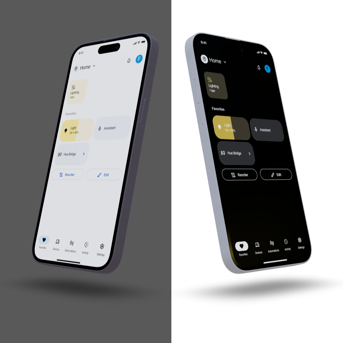
I used Google’s Home app to showcase my skills for this short project, leveraging WCAG 2.1 standards and tools like the Stark Contrast and Accessibility Checker to validate color palette and typography decisions.
Design approach
Design System Foundations
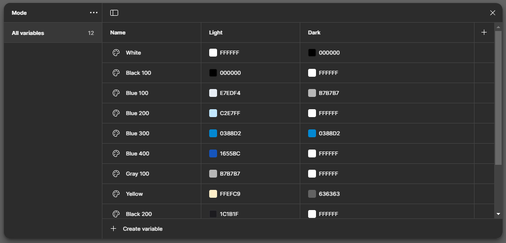
Built a color token- based theming system in Figma with variables for light and dark modes, ensuring scalability across text, background and components (buttons, cards, typography).
Defined tokens for primary accent colors, neutral grays, text and background tones.
Applied these consistently to buttons, cards, and text components.


Outcomes
Created a accessible, dual mode UI screen that pass WCAG contrast checks.
Ensured consistent usability across both modes that works equally well in light and dark.
What I Learned
Accessibility first: Designing for contrast and readability made me more confident with WCAG standards.
Design systems thinking: Using tokens in Figma gave me growing knowledge for scalable systems.
User context matters: Mode switching is not just a feature, it directly impacts comfort, usability, and inclusivity.
Next Steps
If developed further:
Explore extending tokens into motion and iconography for a fully systematized dual mode library.
Explore metrics such as reading speed or perceived eye strain in different modes.
Expanding knowledge of primitive, semantic and component token tiers.
Reflection
Recreating Google’s home app on iOS mobile, gave me hands-on practice in applying accessibility standards and using Figma tokens. It gave insight into how small details like color contrast and mode switching can have a big impact on inclusivity and user comfort. As a designer, it showed me how to combine craft and systems thinking to create interfaces that are adaptable to different user contexts.