
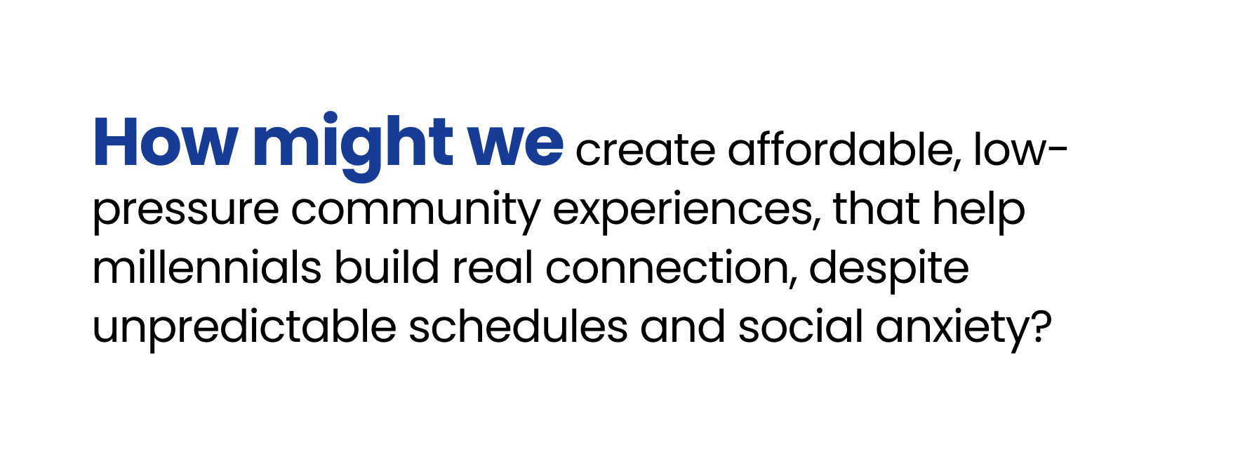
Connecting Millennials Through Local Experiences
A UX case study exploring how structure and progressive disclosure can increase real-world participation.
Role: Product Designer (end-to-end)
Focus: UX research · Interaction design · Iteration
Duration: 16 weeks - Capstone project
Platform: Mobile
Methods: Interviews, Surveys, Affinity Mapping, Usability Testing
Tools: Figma, Figjam, Notion, Fathom, Chat GPT, Google docs, Zoom
Problem
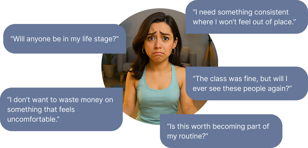
Millennials express strong interest in social connection, but participation drops sharply at the moment of commitment.
Why
Social risk and unpredictability
Expensive or rigid structures
Lack of continuity between events
The friction wasn’t awareness. It was commitment anxiety.
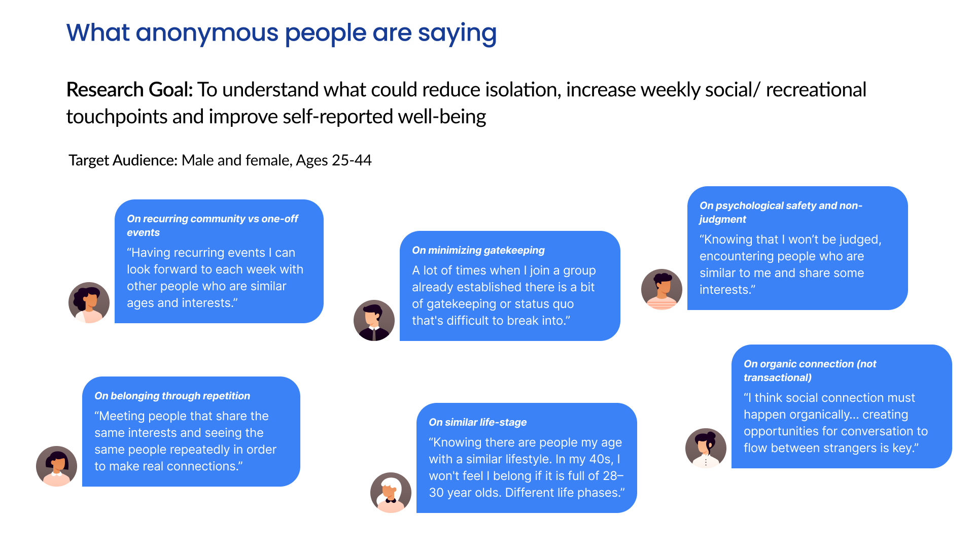
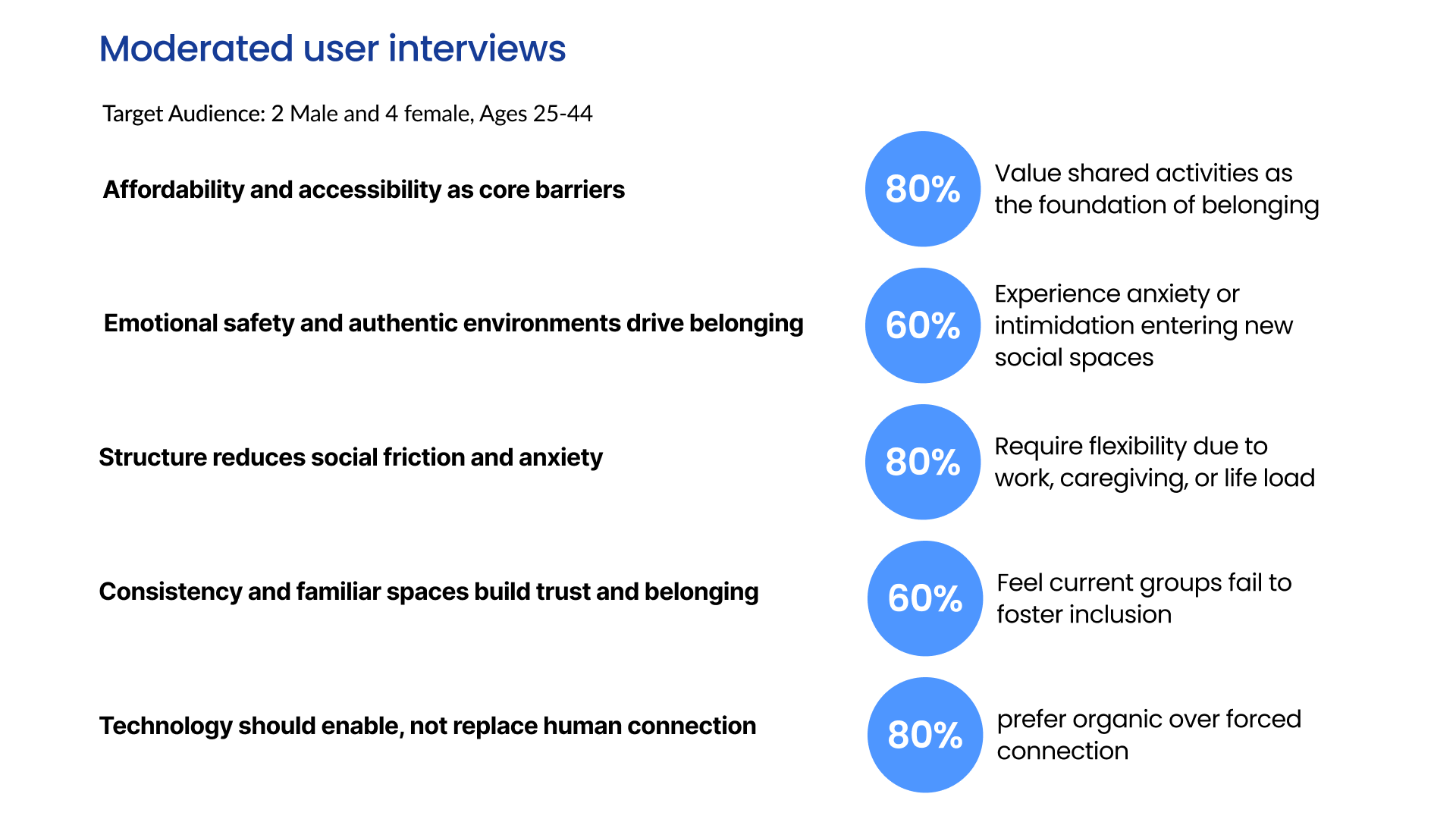
Research and Insights
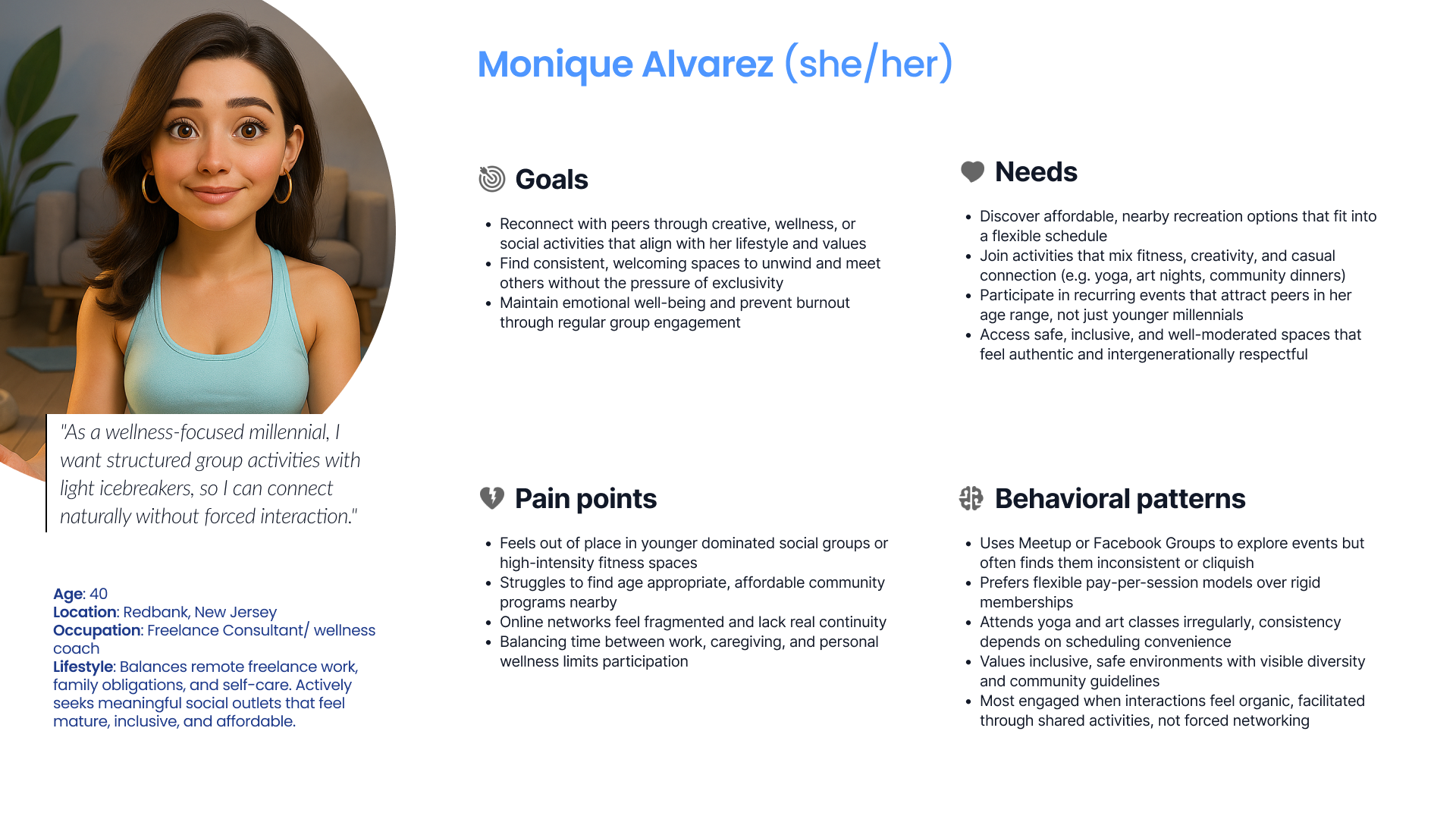
Research approach
Moderated interviews (ages 25–44)
Anonymous surveys
Affinity mapping synthesis
Key insight
Emotional friction, not lack of interest, was the primary barrier.
Supporting Patterns
Low-pressure entry increases engagement
Clear structure reduces uncertainty
Continuity builds trustI studied how users experience in-person social platforms through moderated interviews and anonymous surveys with participants aged 25–44.
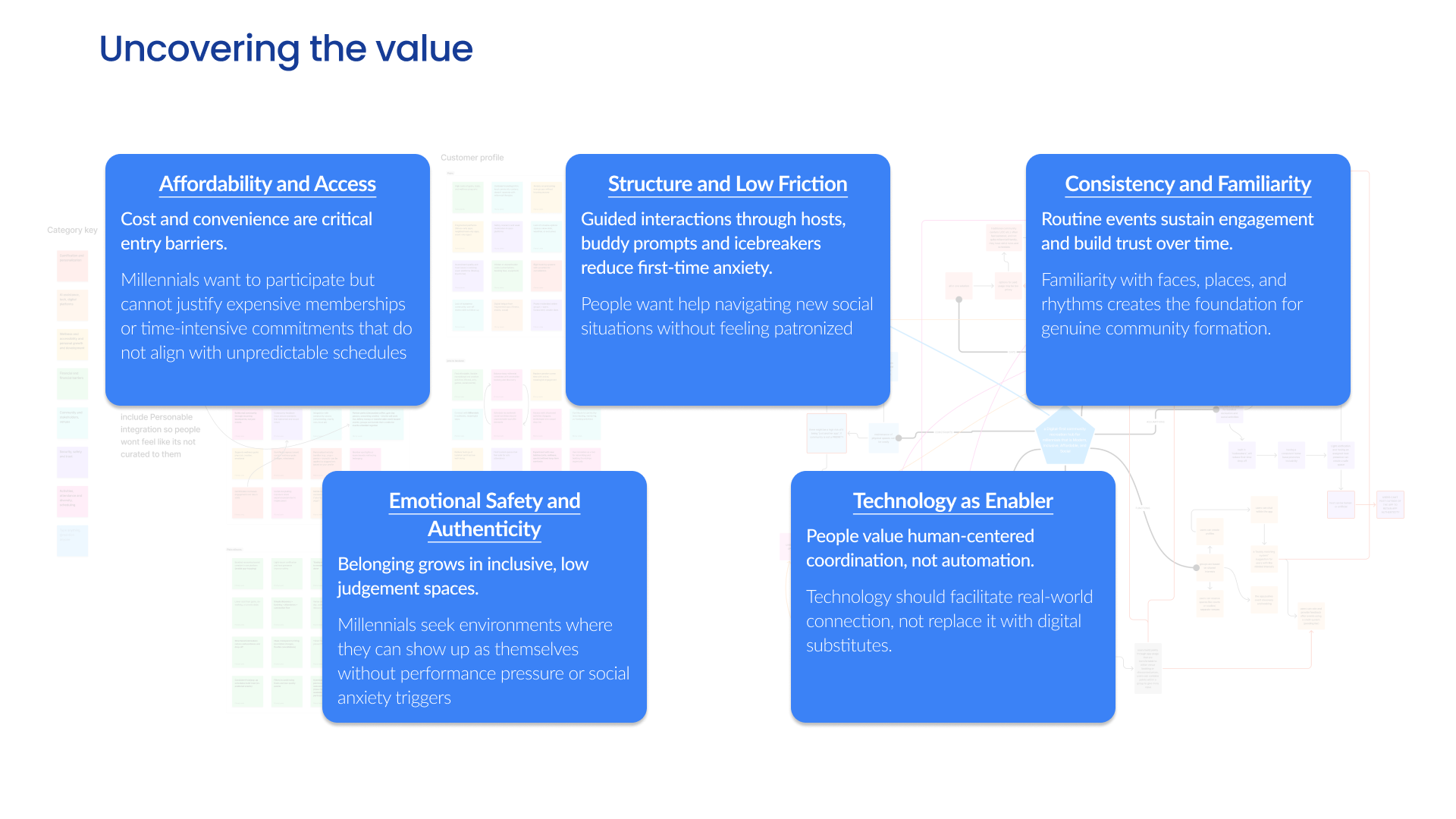
Design principles
Based on the research, I defined three guiding principles:
Emotional safety to reduce social risk
Clear structure to lower cognitive and decision load
Continuity to support repeat participation
These principles became the filter for all design decisions.
Solution
Progressive commitment
Interest-first interactions instead of hard RSVPs
Clear previews of vibe, attendees, and structure
Structure cues
Host visibility
Structured entry flow
Progressive disclosure
Continuity loop
Recurring groups
Post-event prompts
Continuity cues
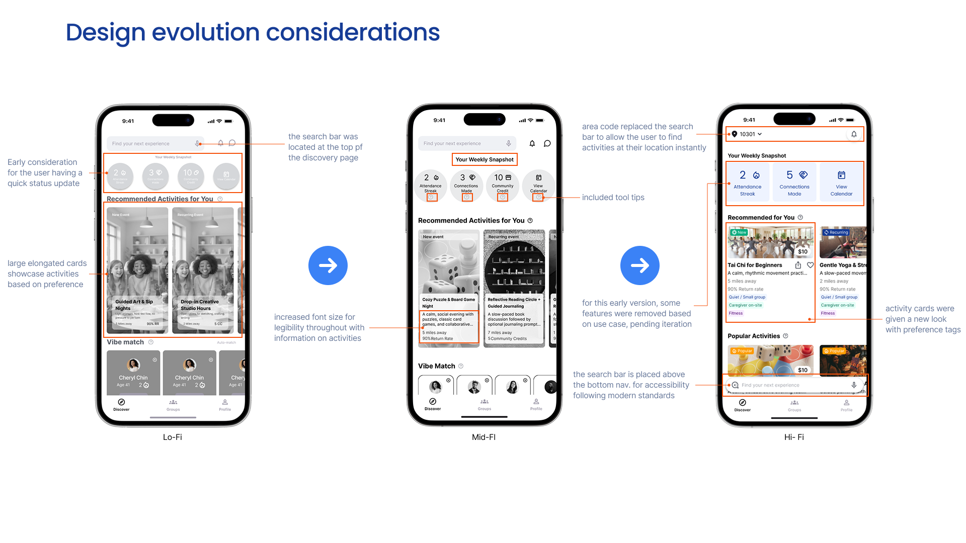
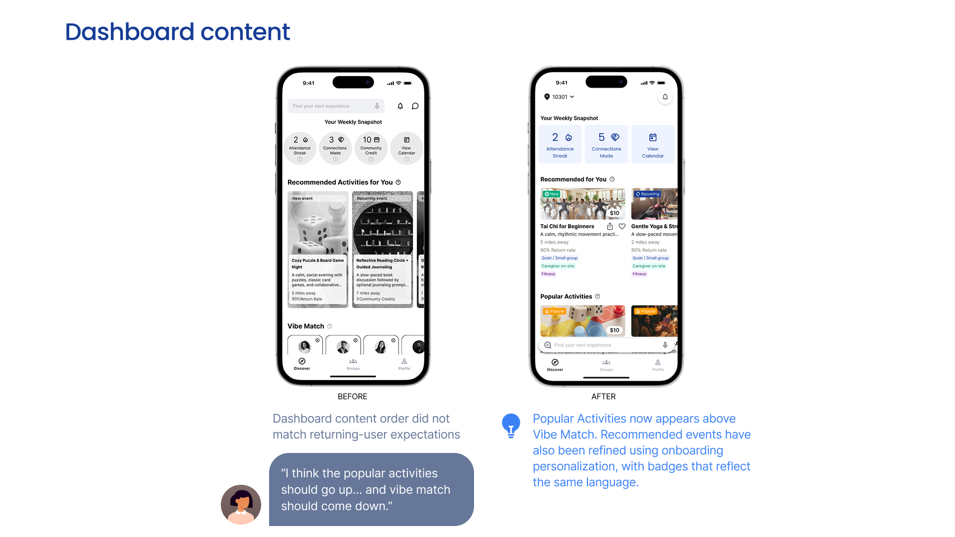
Validation and iteration
I conducted usability testing focused on:
Reducing cognitive load
Clarifying expectations
Lowering social anxiety
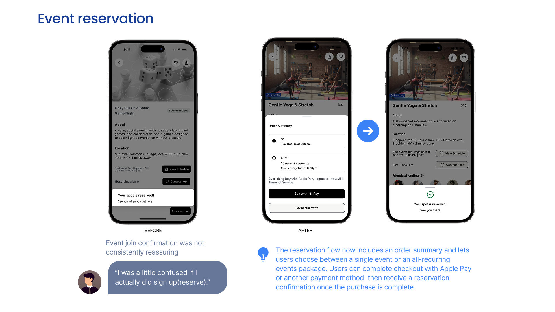
What Changed
Refined discovery layout
Clarified booking confirmation
Adjusted structure cues
Outcome
Usability testing indicated:
Increased clarity around participation expectations
Reduced hesitation before booking
Higher perceived confidence in attending
Key decisions and trade-offs
Prioritized continuity over feature breadth
Deferred advanced AI to avoid over-automation
Focused on refining core flows deeply
Reflection and next steps
What I learned
Belonging is a systems problem, not a feature problem
Structure can reduce anxiety without removing agency
Calm, intentional interfaces build trust
What I’d do next
Test with more diverse community type
Quantitatively test commitment thresholds
Explore social graph integration to increase trust
Measure drop-off between interest and attendance
This project reinforced the importance of designing for behavioral reality over aspirational intent it also strengthened my ability to design for follow-through, not just interest.