Conceptual Travel App
Reducing planning friction to help people commit to travel with confidence
Role: UX Designer (end-to-end)
Scope: Research · Interaction Design · Prototyping · Heuristics
Duration: 4 weeks - Class project, March 2025
Platform: Mobile
Problem
Planning a trip often creates more friction than the trip itself.
Users described travel planning as:
Time-consuming and cognitively heavy
Overwhelming due to too many options
Difficult to translate inspiration into a concrete plan
As a result, many trips stalled at the research phase or defaulted to familiar, suboptimal choices.
Challenge: How might we reduce planning friction so users can move from inspiration to commitment with confidence?
Research and insights
I explored how people currently plan trips through exploratory interviews and secondary research focused on early-stage travel behavior.
My interviews with travelers revealed a shared frustration across different travel styles: while motivations vary, the decision-making experience itself feels broken.
After synthesizing findings, one core pattern emerged:
The biggest barrier was decision overload, not lack of intent to travel.
Three insights consistently surfaced:
Inspiration is abundant, but direction is missing - Users could imagine traveling, but struggled to translate ideas into plans.
Too many choices reduce confidence - Comparing destinations, dates, and options increased anxiety rather than clarity.
Commitment happens only after reassurance - Users needed clearer signals that a trip was “worth it” before booking.
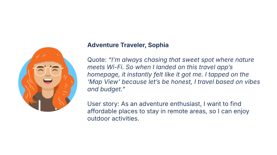
These insights created two proto-personas and shaped the product strategy.

Design exploration and iteration
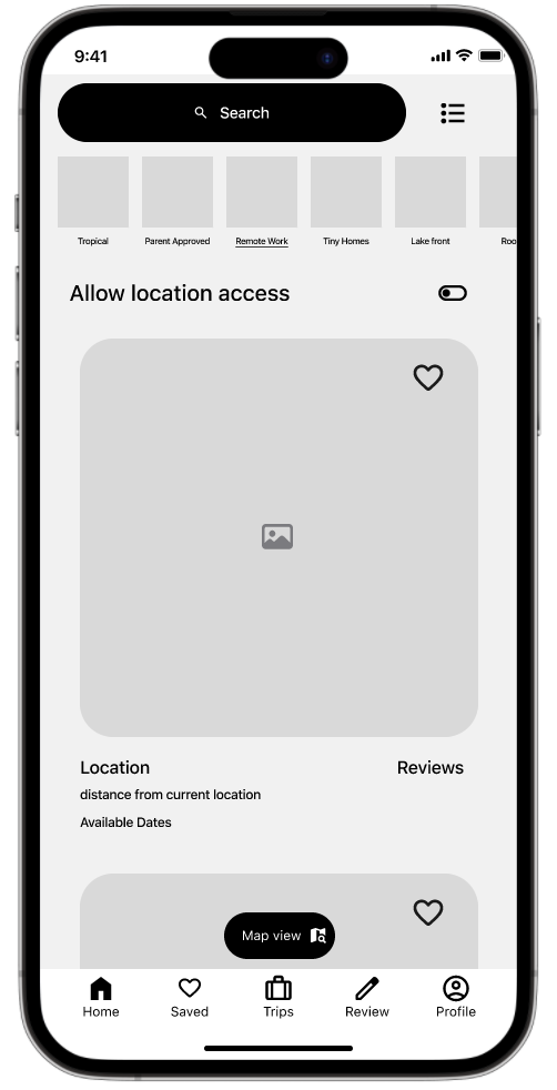
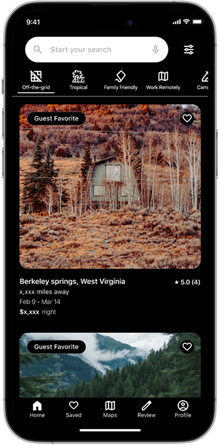
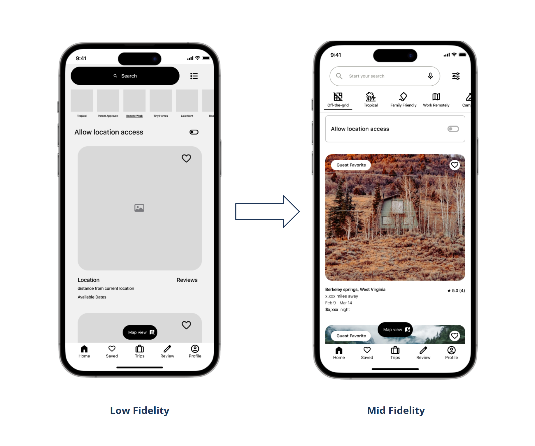
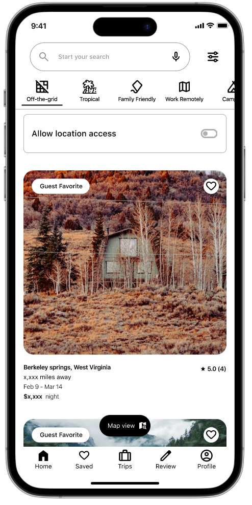
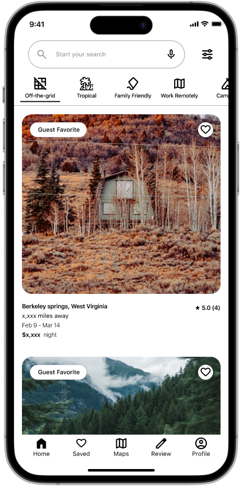
I then made a simple low-fidelity wireframe based on Airbnb’s UI interface to test layout, then a mid-fidelity prototype to improve clarity and navigation from usability test results.
Based on research, I defined three guiding principles:
Clarity over abundance - Fewer, better-framed options increase confidence.
Progressive decision-making - Break planning into manageable steps rather than one heavy lift.
Reassurance before commitment - Help users feel confident before asking them to book.
These principles guided all design decisions.
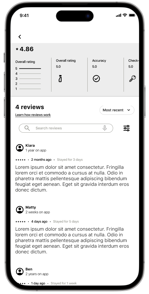
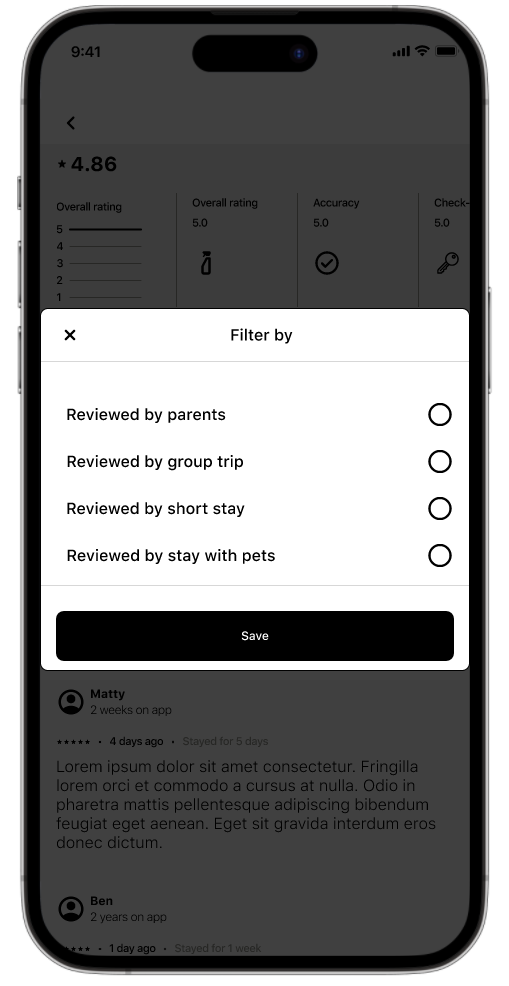
Upon exploration, reviews surfaced trust issues driven by undifferentiated feedback and dense text.
Introducing structured review dimensions (e.g., accuracy, cleanliness) and contextual filters (parents, group trips, short stays, pets), improved standability, relevance, and user confidence by letting travelers quickly assess credibility based on situations similar to their own.
Solution
I designed a conceptual travel experience focused on progressive planning rather than exhaustive search.
Key product decisions included:
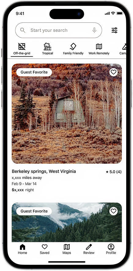
Curated recommendations instead of open-ended browsing
Step-by-step planning flows to reduce cognitive load
Contextual reassurance through cost, timing, and expectations
The experience was designed to help users move forward incrementally rather than feel pressure to finalize everything at once.
The core flow supports three stages:
Explore travel ideas without committing
Narrow options with guided decision-making
Transition from planning to booking with confidence
Usability testing
I tested early concepts through usability walkthroughs, focusing on:
Whether users felt clearer about next steps
How easily they could narrow choices
Where hesitation or drop-off occurred
Iterations prioritized reducing uncertainty and decision fatigue at key moments in the flow.
Core tasks: find remote stays, view map, read reviews, find family‑friendly options.
Findings:
40% had trouble finding reviews.
80% couldn’t access the map view.
70% wanted bundled booking options (stay + activity).
Outcome
The final prototype delivered a clearer, user-centered experience that better supported returning users
This concept validated a key hypothesis: Reducing planning friction increases confidence and willingness to commit.
Early feedback indicated:
Improved clarity around travel decisions
Less anxiety during planning
Greater momentum toward booking
Usability testing results
80% of participants completed the main tasks in under 20 seconds.
Participants found the interface less overwhelming and more engaging than the previous mid-fidelity prototype.
50% of participants who used Airbnb said they felt more comfortable with this interface.
Design improvements included:
A review filter by traveler type to boost trust and visibility. Bundled booking suggestions to simplify choices. Moved the map button to the bottom navigation to improve access and give more vertical space for scrolling.

Reflection
This project strengthened my skills in design systems, usability testing, and rapid prototyping. I learned how small usability adjustments, like improving map visibility or surfacing reviews, can significantly affect user confidence and engagement. While initial testing showed promise in reducing cognitive overload and improving clarity around reviews and booking choices, the feedback also revealed that trust and ease of use vary significantly across traveler types, contexts, and accessibility needs.
Next steps
If developed further:
Expand testing with a larger, more diverse sample
To validate whether trust signals and simplified navigation work consistently across families, solo travelers, international users, and last-minute planners. This helps ensure the experience feels personal and reliable at scale, not just for a narrow user group.
Explore accessibility features (e.g. alternative navigation patterns)
To reduce visual fatigue and navigational overwhelm, particularly for users browsing under time pressure, in low-light environments, or with accessibility needs. Improving accessibility directly supports clearer decision-making and reduces frustration during booking.